In this tutorial we provide some notes for a more refined effect where you might want to use other effects in combination with Video Gogh. In addition we provide some reasons why you might want to apply Video Gogh in multiple passes
Painting in Layers
Often you want to split your image in 2 or 3 layers. The layers might overlap. In painters term you might want more "loose" stroking for the background and finer/tighter brushes stroking for some object of interest in the foreground. In this project we will do just that.
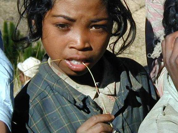
Figure 1: Above is our source image.
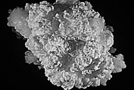
Figure 2. Above is the user-defined brush we will use (we grabbed a frame from our Artbeats stock footage collection, which is then used as a user-defined brush in Video Gogh Pro).

Figure 3: In order to get a very loose abstract base, we use a large brush size. Of course note now the features of the original image are hard to read.
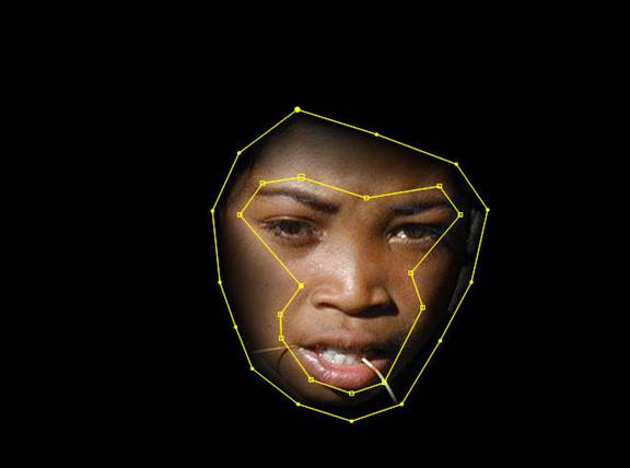
Figure 4: In order to bring out more detail in the face we will apply the Video Gogh effect twice. Above we define a vignette using our PV Feather plug-in (other techniques would do). The main consideration for the vignetting is this: We want to paint details with a smaller brush stroke but we don't want to see a dramatic cut where the brushes are applied at a different size.
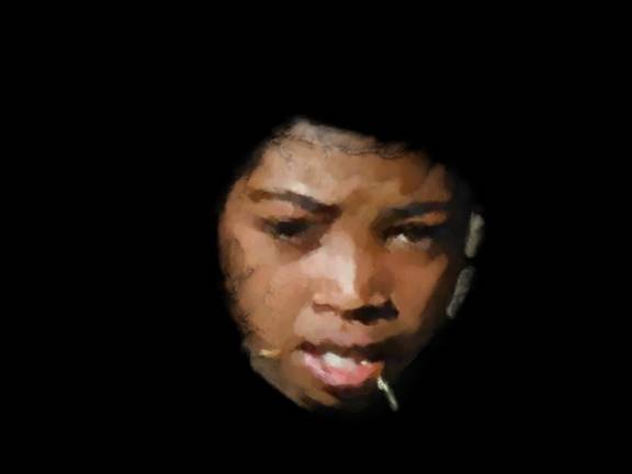
Figure 5: Above we show the vignetted area painted with smaller brush strokes. Note that we also strategically placed the feathering as much as possible in the area of the face that has the least details (the smoothest surface).
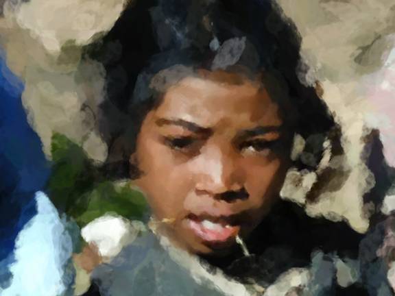
Figure 6: Now we composite the face layer, with smaller strokes, over our base pass. It is not uncommon to use 2 or more layers of Video Gogh for a best result. In this shot for example, one might want to make the mouth / teeth area even tighter in this case, which would require another layer with a finer matte to isolate that area.
Pre-Processing
Since Video Gogh samples colors from the image, it makes sense to prepare color sources so we start with colors as close as possible to what we want the painted image to look like. For example, a painting might be typically much more saturated then a photograph. Also to produce a more impressionistic look you might want to simply add some color noise to your source. Again of course if you do things like that, at some point it's worth having the motion and direction source point to the original pre-processing source so that the noise or color changes aren't the sources tracked or used for orientation of the brushes (unless, of course, those perturbations in orientation and tracking look are what you desise).

Figure 7: Alternatively you might want to reduce details and remove noise with a tool like DE:Noise. Above, we used our SmoothKit Diffuse plugin in Median mode as a first pass before applying Video Gogh.
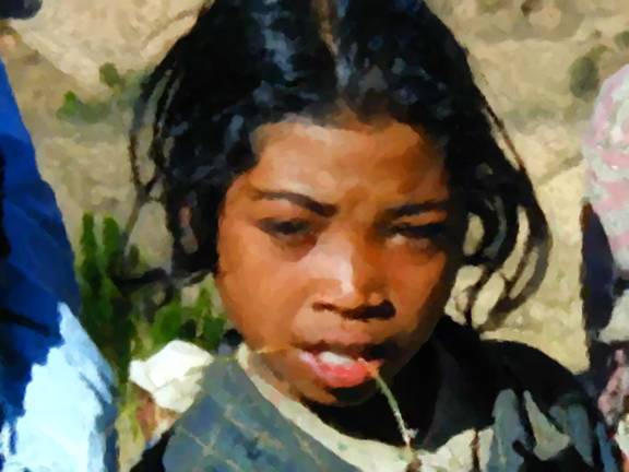
Figure 8. Above shows a picture where we tuned the color first so that it's more vibrant, much like what you would expect from a painting, and then we applied a small brush size. The brushes essentially remove the "image processing" look of our previous intermediate result.